
Colour drenching is one of the few decorating ideas you can spot from the doorway. It's the hall where the skirting boards melt into the walls, the bedroom with a ceiling the same inky green as the alcoves, the sitting room with no white band at the top to interrupt the mood. Done well, it feels calm, considered and quietly expensive. Done badly, it feels like an empty box painted one colour. The difference is almost entirely in the choosing.
Drenching means painting every surface in a room — walls, ceiling, woodwork, and often doors and radiators too — in tones that belong together. Not necessarily one tin, and not necessarily the same colour everywhere. There are three usual approaches.
Whichever you pick, the aim is to remove contrast between the surfaces that meet at the edges of a room. That's the whole trick.
Most rooms are painted with built-in visual stops. A white ceiling meets coloured walls and your eye registers a line. White skirting meets the floor and another line appears. Individually these are small things, but together they draw attention to the room's boundaries — its height, its width, the odd corner where a chimney breast was boxed in.
Take those lines away and the eye has nowhere to snag. Walls feel taller because there's no band marking where they end. Corners soften. Awkward architecture stops announcing itself. In a small room the effect is pleasingly counter-intuitive: a deep colour with no interruptions tends to read as more generous than the same colour chopped up with white.
There's a practical bonus, too. Drenching hides a multitude of imperfect edges — the wobbly bit where wall meets ceiling, the lumpy plaster behind a radiator, the dado rail you'd rather forget.
Flat is what happens when a room is painted one colour with no thought given to light, tone or finish. Cohesion comes from three decisions.
North-facing rooms pull colour cool and grey. South-facing rooms warm it up and make everything look stronger than it did in the shop. East light is blue in the morning and flat by afternoon; west light is dim until it turns golden. This is why testers matter more than paint charts. Paint two large patches — A2 is not too big — on different walls, then look at them at breakfast, at dusk and under the lamp you actually use. If a colour goes muddy or sour at any point in the day, it's the wrong colour for that room.
The most common reason a drenched room looks slightly off is a mismatch underneath. A warm greige sitting next to a cool grey-blue will read as a mistake, even when both are lovely shades on their own. Lay your candidate strips side by side, edge to edge, and squint. If one looks greenish and the other pinkish, separate them.
Three reliable formulas. Palest tone on the ceiling and deepest on the woodwork gives gentle lift and works almost anywhere. The same colour everywhere, varied only by finish, is the purest version and the most calming. Putting the deepest tone overhead is more dramatic — it pulls the ceiling visually lower, which is wonderful in a bedroom and less so in a kitchen where you want the room to feel airy.
Even from the same tin, matt and eggshell read as different colours on the wall. Eggshell has a low sheen that catches light and pushes the colour a shade deeper, which is helpful on skirting and door frames: it defines the shapes without introducing a new tone. Matt emulsion on walls and ceiling absorbs light and keeps things soft.
Two things to watch. Washable matt has a slight sheen of its own, so if you use it on the walls and a standard matt overhead, expect a faint difference in depth. And buy all your paint in one go — tins from different batches can vary slightly, and a drenched room has no contrast to hide it.
Hallways are the classic case. They're usually short on windows, full of doors and chopped into segments by the staircase, and a single tone pulls the whole thing together. Bedrooms suit deeper drenching particularly well, since they're used mostly in lamplight, when dark walls turn warm and enclosing rather than gloomy. Small box rooms, oddly shaped attic rooms and anywhere with a boxed-in pipe or an awkward return wall all benefit.
Be a little more careful in rooms where you need to see what you're doing: kitchens, bathrooms, utility rooms, home offices. Drenching still works there, but keep the palette mid-tone rather than deepest-dark, and make sure your task lighting is up to it.
If you're nervous about a very dark scheme, start with a hallway or a spare bedroom. They're low-risk rooms, and they'll teach you more about how colour behaves in your house than any paint chart can.
Photo: Daria-Yakovleva / Pixabay

A practical spring checklist for UK homes: cleaner windows, lighter textiles, brighter accessories and fresh...
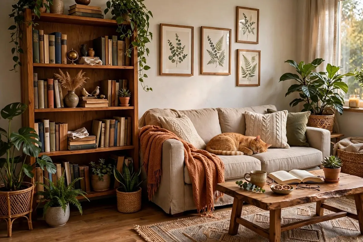
Learn how to combine linen, velvet, wool and cotton cushions by texture, scale and colour, and layer them...
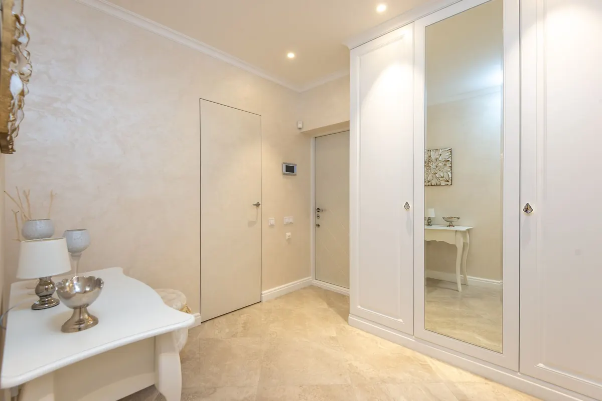
Ten practical ways to make a small UK hallway feel wider and brighter, from oversized mirrors and layered lighting...

Feather-light inspiration for beautiful rooms..